How to Create an Effective LED Billboard Ad: Design Rules for Moving Digital Outdoor Advertising
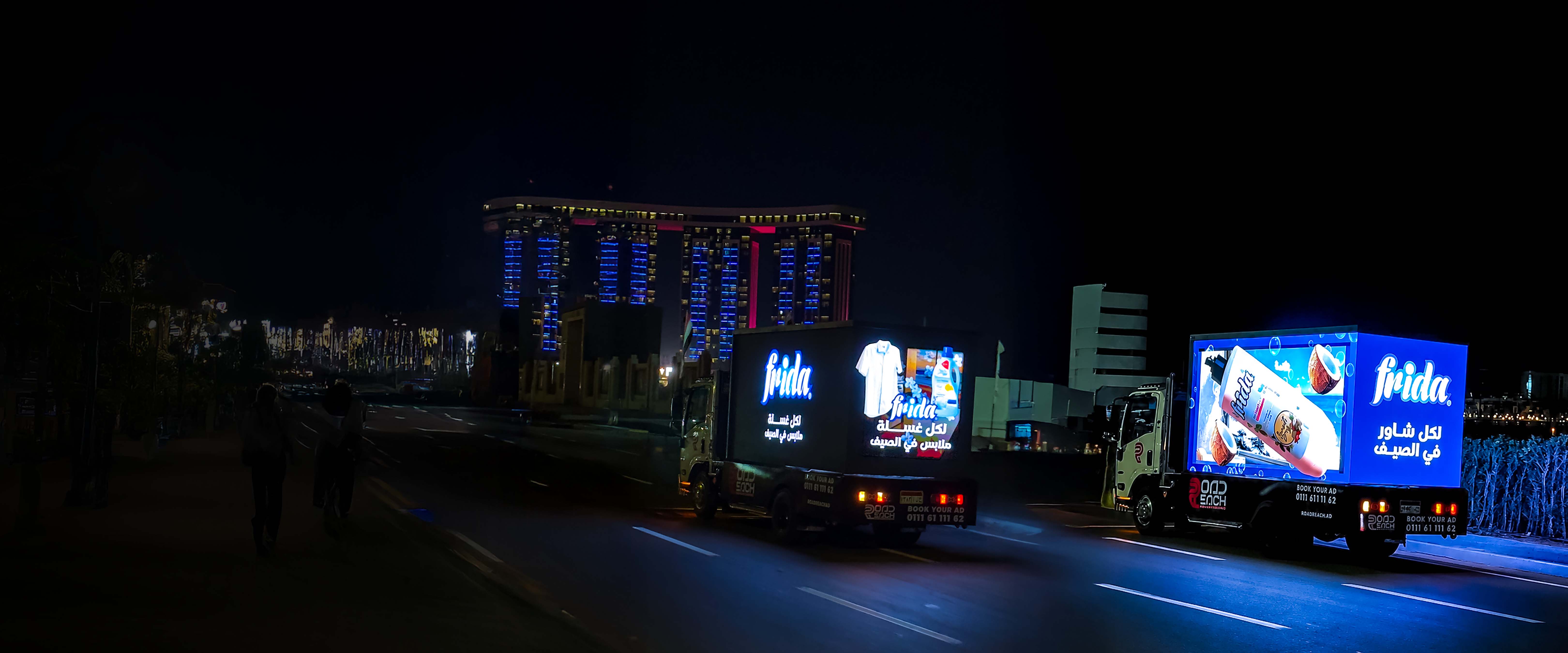
An effective LED billboard ad has seconds, sometimes less, to land while a viewer is moving, in traffic, or glancing up from the street. The rules that make it work are different from a printed billboard or a social video: high contrast, minimal text, motion that guides the eye, and one clear message. Here's how to design digital outdoor advertising that actually gets read on a moving screen.
Step 1, Lead With One Message
A moving screen is not the place for everything you want to say. Pick one message, a launch, an offer, a single benefit, and build the whole ad around it. If a viewer can't grasp it in about two to three seconds, it's too complex for the road.
Step 2, Make Text Big and Minimal
Use as few words as possible, set as large as possible. Short headlines, big type, generous spacing. A rule of thumb: if you'd need more than a quick glance to read it, cut words until you don't. Legibility from a distance beats cleverness every time.
Step 3, Maximize Contrast and Brightness
LED screens are brilliant, but the street competes, sun, other lights, movement. Use bold, high-contrast color: strong foreground against a clean background. Avoid thin fonts, busy photos behind text, and low-contrast color pairs that vanish in daylight.
Step 4, Use Motion With Purpose
Motion is your biggest advantage over a printed board, but motion for its own sake distracts. Use it to guide the eye to the message and the call to action: a reveal, a product in action, food in motion. Keep transitions smooth and avoid frantic cuts that are hard to follow at a glance.
Step 5, Design for a Short Loop
Your ad plays on rotation, so keep each spot short and self-contained, a few seconds that make sense on their own, because a viewer may catch only part of it. Front-load the brand and the message; don't save the point for the end.
Step 6, End With a Clear Call to Action
Tell the viewer exactly what to do next: visit, order, download, search a name. Keep it short and unmistakable. A great ad with no call to action wastes the attention it earned.
Common LED Billboard Design Mistakes
| Mistake | Why It Fails | Fix |
|---|---|---|
| Too much text | Can't be read while moving | One message, few words |
| Thin fonts / low contrast | Disappears in daylight | Bold type, high contrast |
| Busy background | Competes with the message | Clean, simple background |
| No call to action | Attention wasted | End with one clear CTA |
| Frantic motion | Hard to follow at a glance | Smooth, purposeful motion |
Why the Format Rewards Good Design
On a mobile LED screen, good design isn't decoration, it's reach. A clean, high-contrast, single-message ad gets read by more of the people the screen passes, which means more of your paid exposure actually lands. Road Reach runs 20 m² of high-brightness display up to 10 hours a day, and the brands that pair that reach with disciplined design are the ones people remember off the road.
Frequently Asked Questions
How do you design an effective LED billboard ad?Lead with one message, use minimal large text, maximize contrast and brightness, use motion to guide the eye, design for a short self-contained loop, and end with a clear call to action, so it can be read in seconds by a moving viewer.
How much text should be on an LED billboard?As little as possible. A moving viewer has two to three seconds, so use short headlines in large, bold type. If it takes more than a quick glance to read, cut words.
Why does motion matter on a digital billboard?Motion is the main advantage over a printed board. Used with purpose, it guides the eye to the message and call to action and makes the ad far more attention-grabbing, but frantic, aimless motion distracts and hurts recall.
How long should an LED billboard ad be?Keep each spot short and self-contained, a few seconds that make sense on their own, because the ad plays on rotation and a viewer may see only part of it. Front-load the brand and message.
What is the biggest mistake in LED billboard design?Too much text and low contrast. Both make the ad unreadable while moving. The fix is one message, few words, bold type, and high contrast against a clean background.
Have a campaign but not the creative? Blue Agency's production team designs LED billboard ads built for the road, then runs them on Road Reach, one team from design to street.